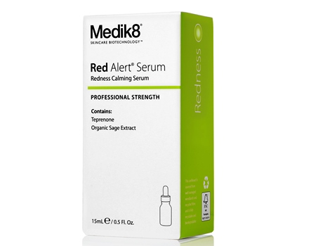
Salon skincare brand Medik8 has updated its look with a complete packaging makeover designed to reflect the brand’s modern outlook.
Makeovers have the power to change the way we perceive people. A new look can bring with it a whole new perspective.
And when it comes to product packaging, it’s really no different.
To align its appearance with its invigorated modern outlook, skincare brand Medik8 recently underwent a makeover of its own.
The brand’s new cartons and rejuvenated packaging comes hot off the back of the complete revamp of its website.
With a focus on a more user-friendly approach, the new cartons and product labels have a clearer solution focus, making it simpler for consumers to determine what concerns each individual product is formulated to address – be it skin ageing, blemishes, pigmentation, dryness redness, dark circles or body.

For the salon, the cartons and product labels have been redesigned to have a stronger shelf presence and increased brand consistency throughout, all while maintaining the heritage of the Medik8 brand.
Functionality was also a chief concern in the redesign, with Medik8’s creamCleanse and Hydr8 Body products moving from pumps to tubes for greater ease of use.
The revamped products are all available in the same sizes and prices, and are being rolled out in salons right now.


