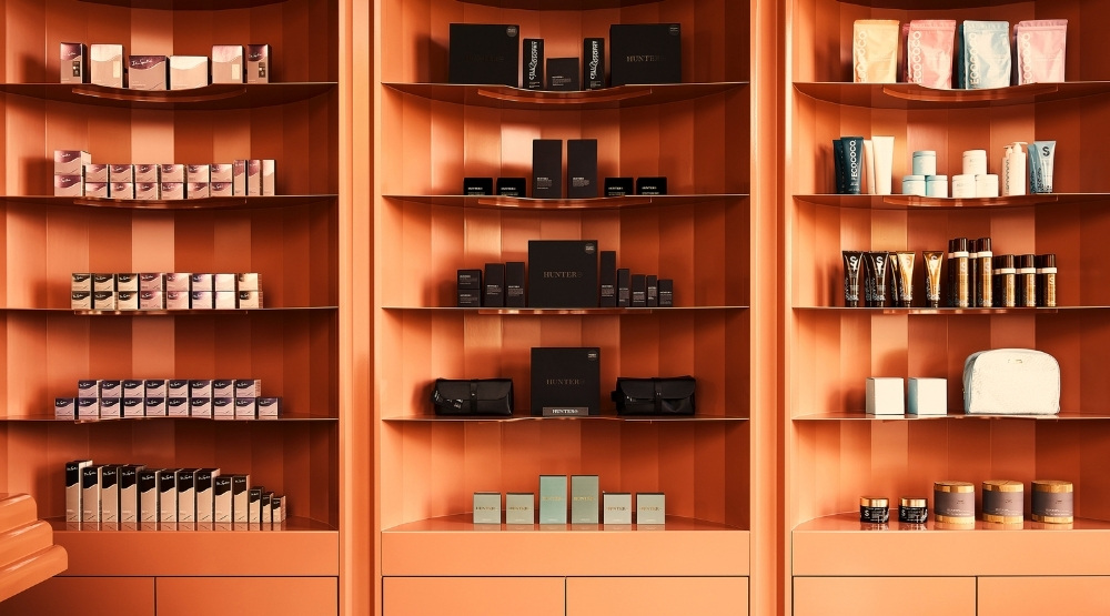
Salon décor trends, for years now, has been all about minimalism. Clean, crisp whites and inoffensive beiges that soothe and offer a neutral backdrop to luxe, well-staged retail displays. But with all trends, there’s eventually a swing in the opposite direction, and that means we’re starting to see the emergence of colour in salon design. The shortlist for the 2021 Dulux Colour Awards featured two beauty establishments and we can’t get enough of their warm, inviting interiors. The Dulux Colour Awards is Australia and New Zealand’s premier showcase of inspirational colour application in interior and exterior residential, public and commercial spaces.
We chatted with the designers and architects behind the interiors at the shortlisted venues – Awesome Nails & Spa and Beauty Block – to find out the inspiration behind the designs to give fellow beauty businesses insight into the process. Take a look behind the curtain to see how these small beauty spaces used design and colour to maximise their curb appeal and customer experience once inside.
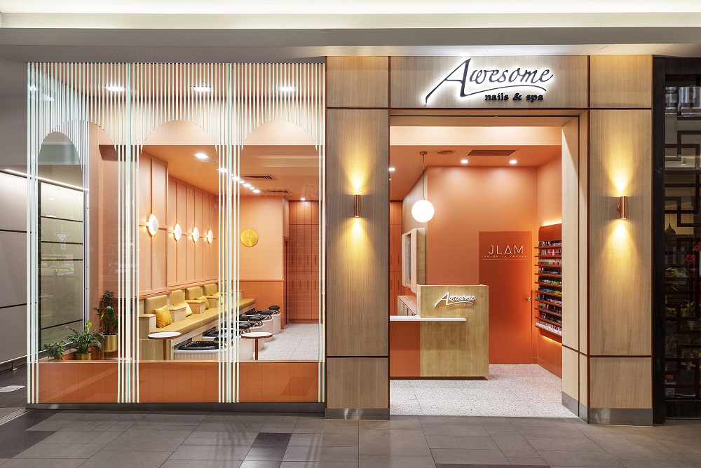
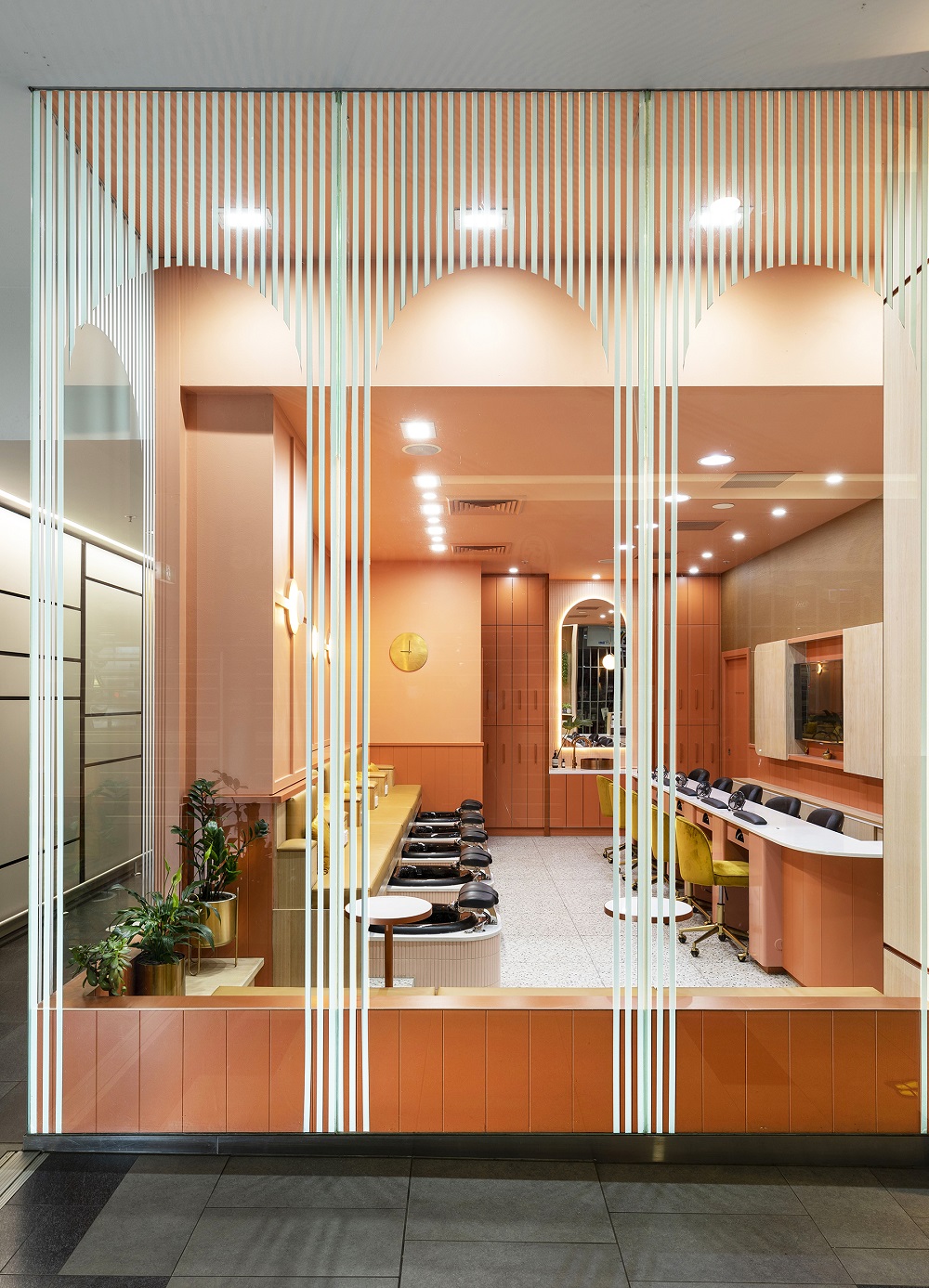
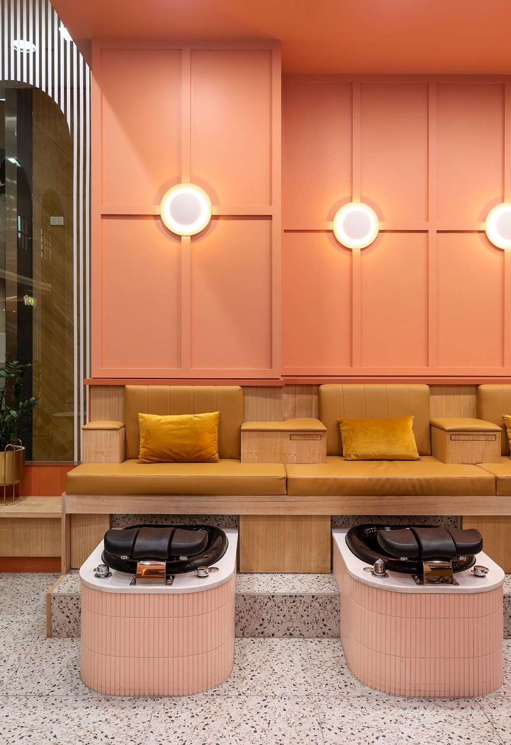
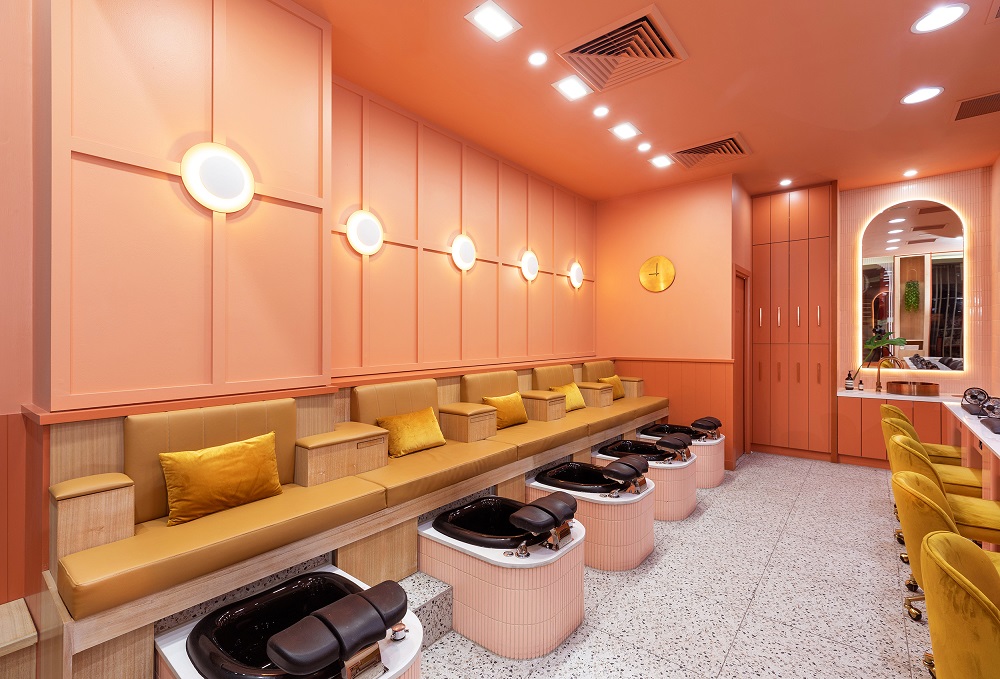
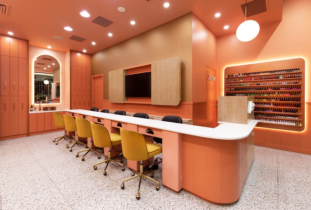
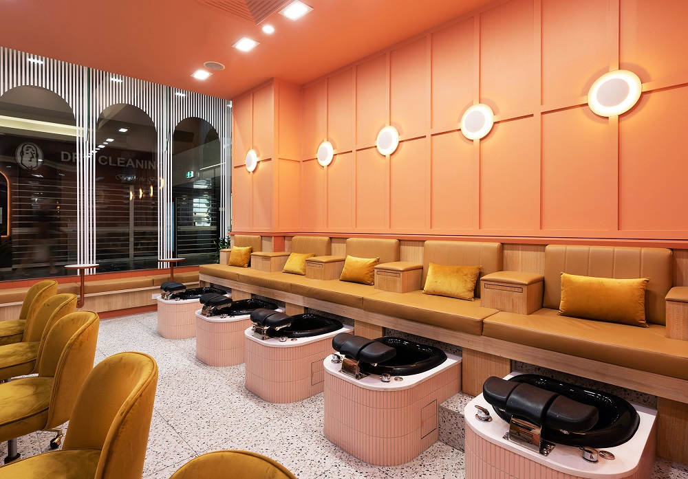
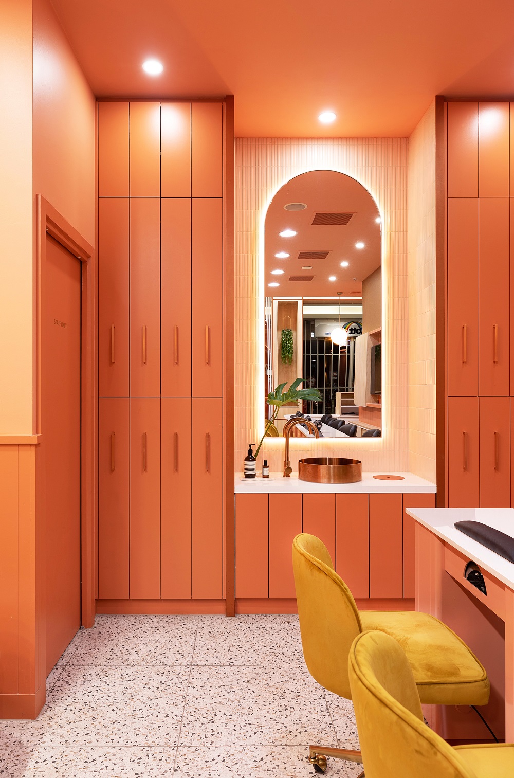
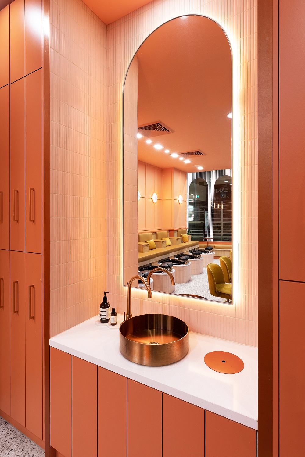
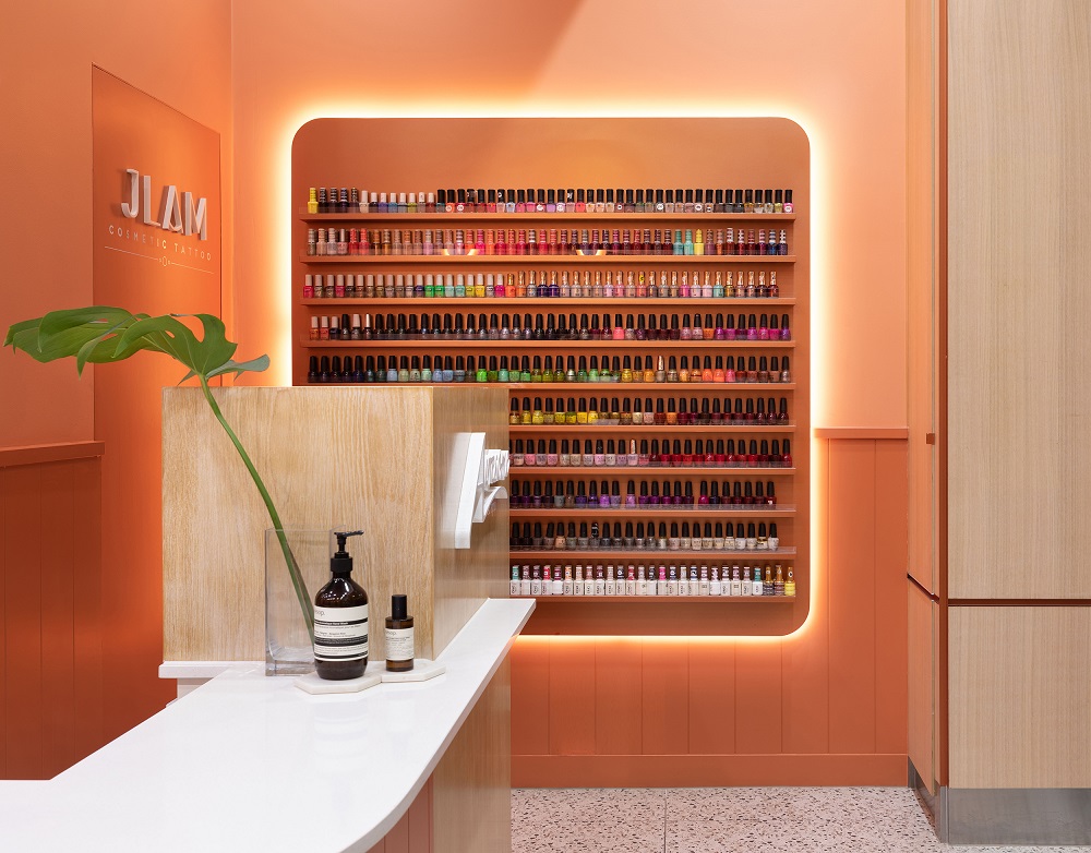
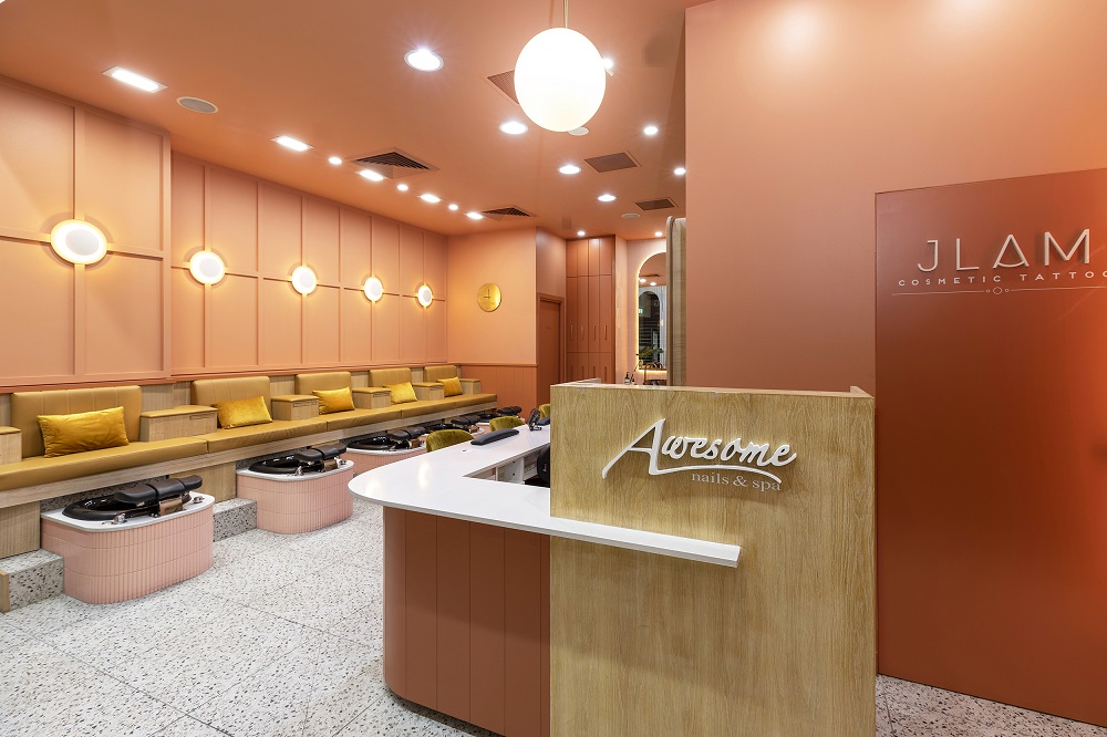
Most of us have been to a nail salon. They are not known for their design nous, which is why Awesome Nails & Spa stands out from the rest with an almost retreat-like atmosphere. Elvin Tan, Principal of Elvin Tan Design is the brains behind Awesome Nails & Spa says “Awesome Nails is a destination nail spa with a touch of whimsy, created from a design approach that embodies the transformative process of the sensory experience. It is a nail spa reimagined as a form of escapism, where customers can come to relax, dwell, be pampered and walk out with a new energetic vibe.”
The brief they were given? “Redefine a typical nail spa with a memorable touch of unexpected fun,” says Tan. Size constraints presented an opportunity for us to go bold, with blush peach complemented with hues of the Australian sunset splashing across the shop creating an illusion of an open space, with no defined boundaries.”
How did they achieve this? Through a warm hug of a palette and materials that invite you in. Tan says “A peach canvas embodied a sense of playfulness and whimsy with a mixture of warm timber counters, blush pink finger tiles, textured walls, mustard-coloured manicure chairs and terrazzo tiles combined to create a relaxing, yet undeniably contemporary and memorable vibe – a step away from the bright harsh artificial light and tired interiors of a conventional nail salon.”
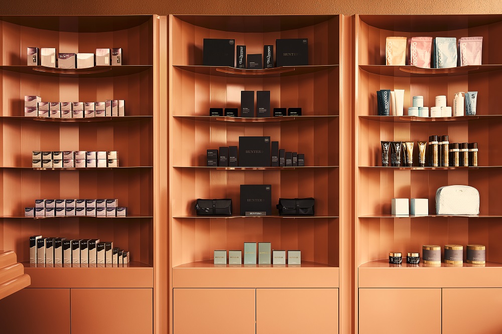
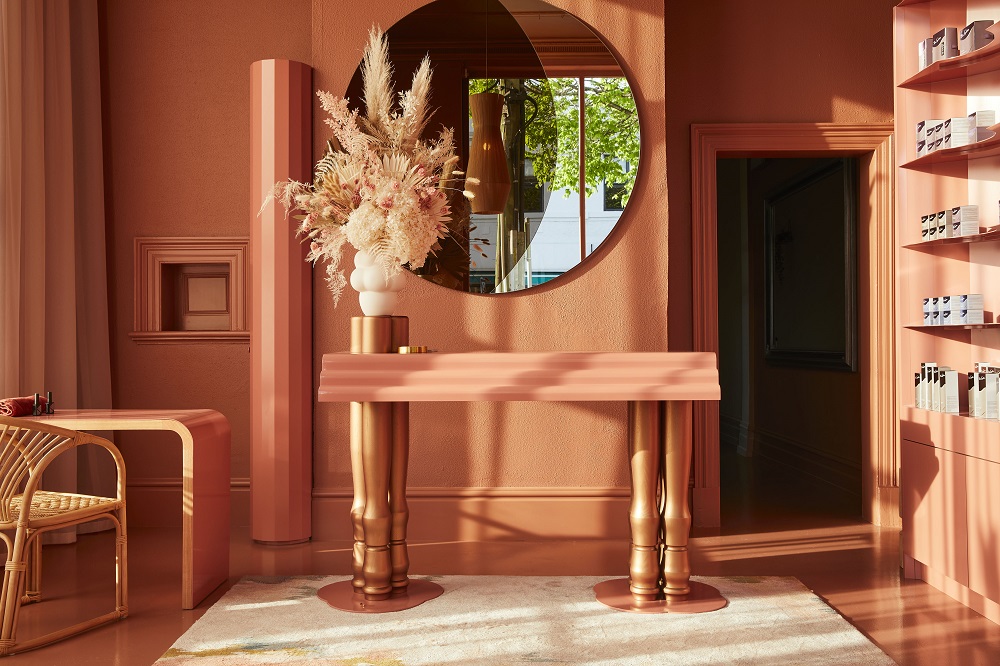
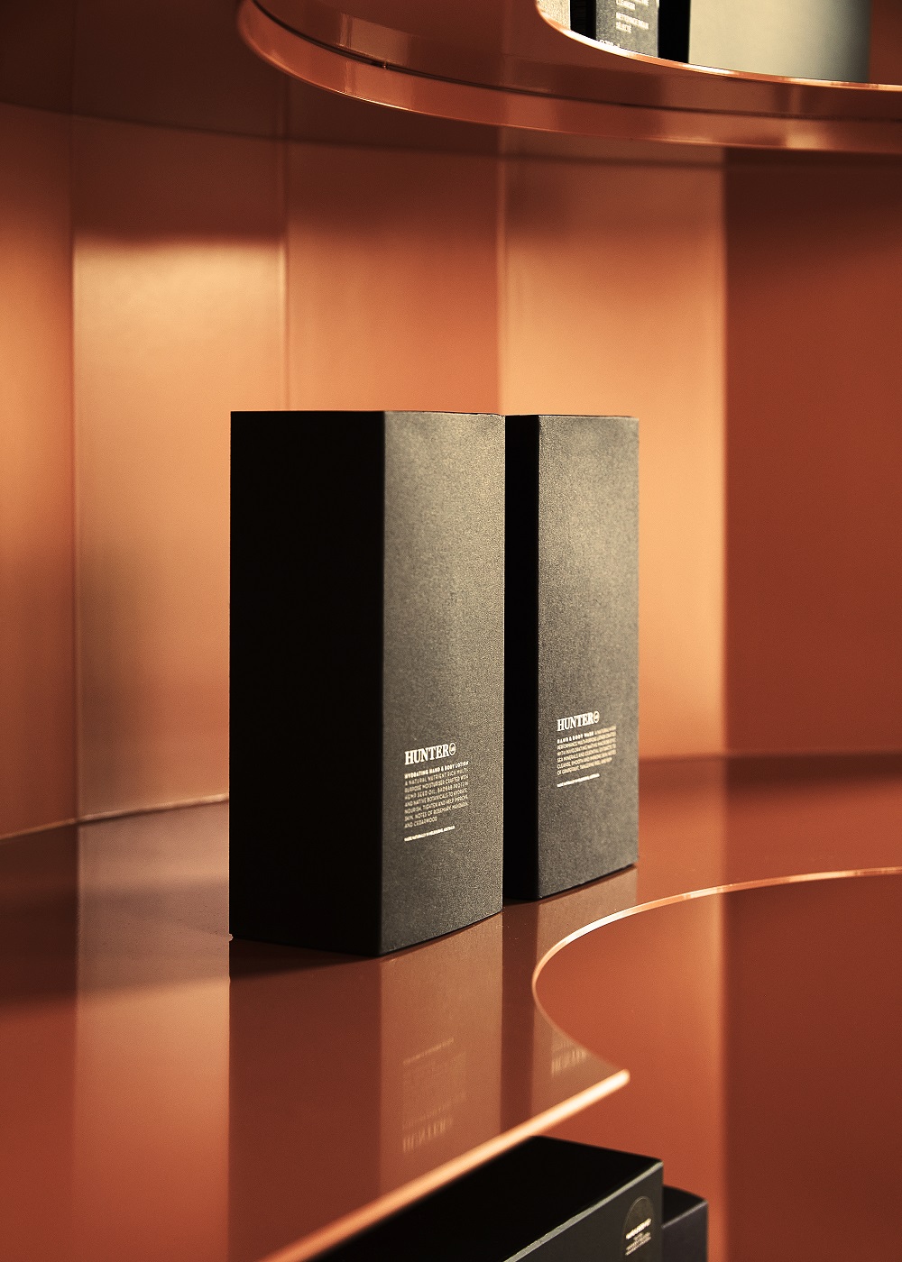
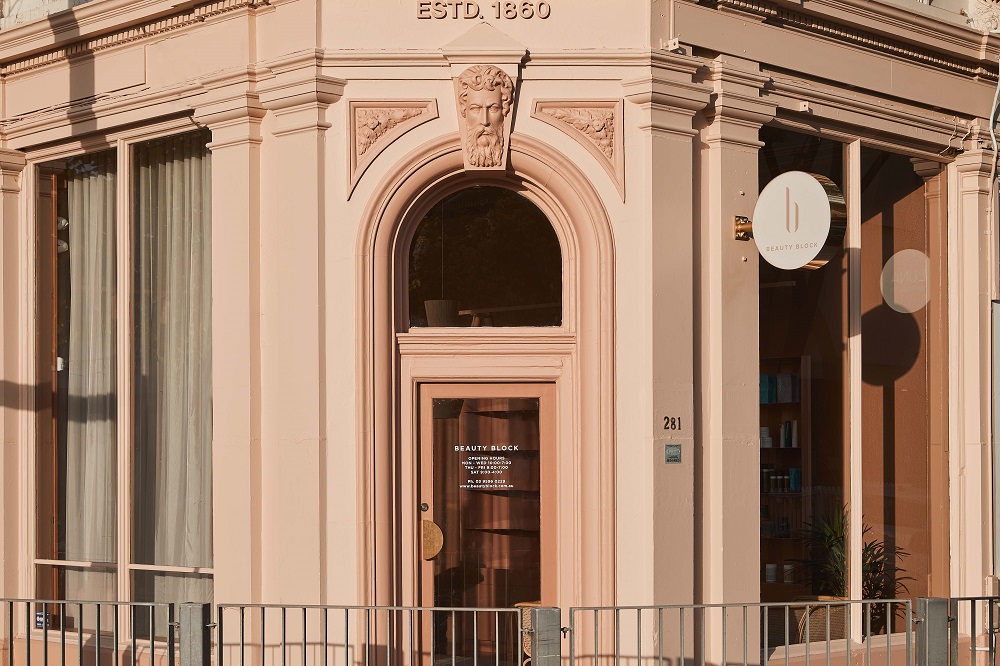
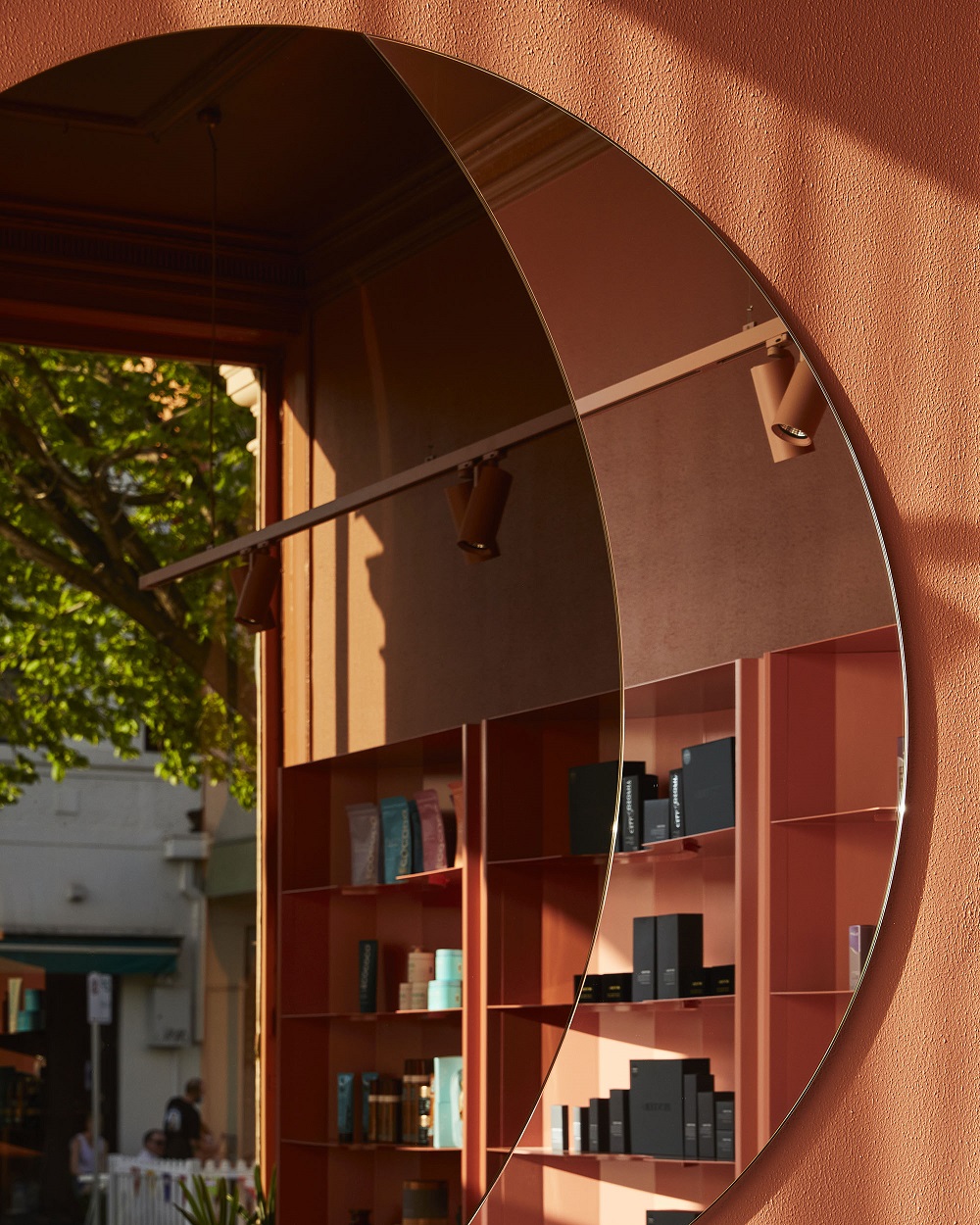
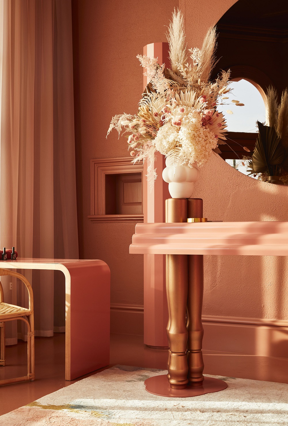
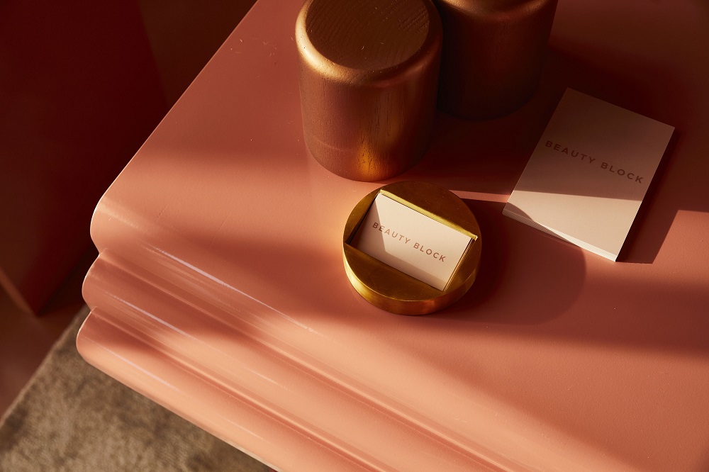
Another Victorian beauty space – Beauty Block – has been similarly shortlisted for its warm yet refined interiors and frontage, also bucking the salon decor trends for whitewashed, opting for peachy hues. Wendy Bergman – Director of Bergman and Co – is Bergman says “Through an exploration of fresh tones and organic forms, Beauty Block delivers a nurturing and uplifting beauty experience in Brighton’s bustling Bay Street precinct.”
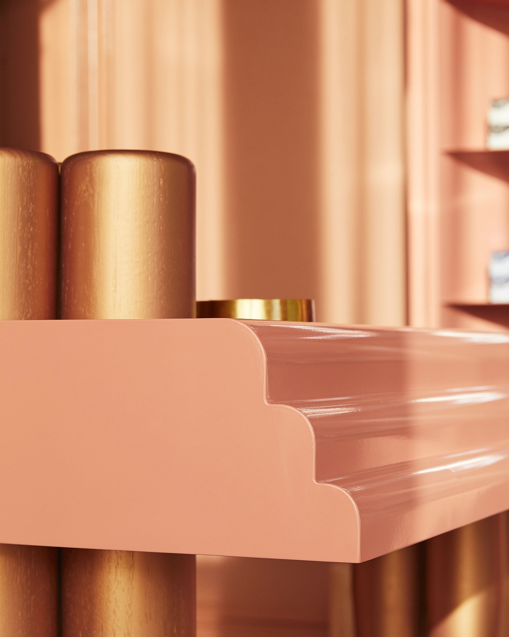
How did they achieve it? Through colour and materials but also, importantly, being mindful about finishes. Think lacquered and metallic to complement the warm colours to keep the design just restrained enough instead of being overly familiar. “A selection of striking fleshy pink and nude hues speak of the human body, while the combination of metallic rose gold and high-gloss lacquered surfaces reflect shimmery cosmetics and nail lacquers central to Beauty Block’s service offer,” says Bergman. “The ornate heritage façade is saturated in a striking blush hue, differentiating the prominent corner site from the streetscape, and setting a playful tone for the interior. Here, a deep flesh tone envelops the space, immersing visitors in a warm atmosphere combining reception, retail, nail, and lounge spaces.”
The business also employed the use of craftsmen to create custom furniture and joinery made to work seamless in the space. “The layout is anchored by a central lacquered console, custom designed in collaboration with local maker Please Please Please. Triple-scalloped edge detailing and ornate turned timber legs give a striking sculpted quality, subtly embellished with rose gold accents. The adjacent nail bench provides a sleek counterbalance, while a custom dual-tone mirror increases the sense of space. Bespoke retail shelving creates a minimalist backdrop for the display of beauty products, complementing Beauty Block’s boutique service offer,” says Bergman.
“Fine facets to the joinery back panel and a single scallop to each shelf show precision and restraint, while a faceted column cabinet discreetly houses the salon’s nail lacquers in a refined gesture. Rattan furniture, timber tables and a woven pendant overlay the interior with gentle tactility. Sheer drapery brims the perimeter, softening the store’s angular footprint while gently filtering natural light. Flexible track lighting highlights key moments of the store experience, its custom wet-sprayed finish fusing with the golden hue of the ceiling beyond.”
Bergman says that “While compact in scale, Beauty Block packs some punch with its monochromatic palette and bespoke detailing; a spirited homage to beauty, reflecting the quality and care of the Beauty Block experience.”
—
Read the current issue of our digital magazine here:
For more news and updates, subscribe to our weekly newsletter.
—
Have an idea for a story or want to see a topic covered on our site and in our pages? Get in touch at info@professionalbeauty.com.au.

